


Color Portfolio
3.9374.00 Reviews
App Specs
- Version
- 3.1.1
- Updated On
- License
- Free
- Downloads
- 500,000+
- Developer
- Benjamin Moore Co.
- Categories
- House & Home
- Platform
- Android, iOS
Screenshots
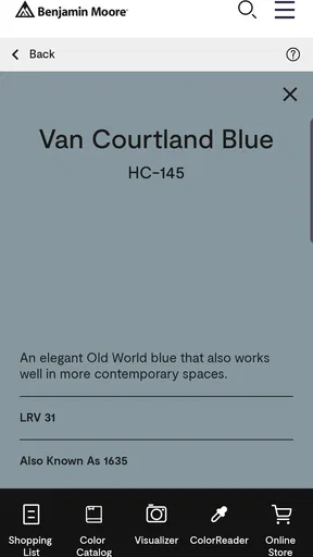
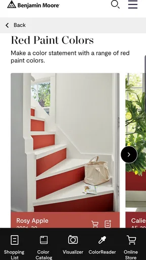
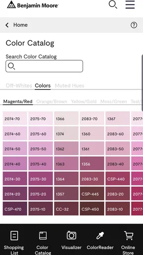
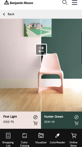
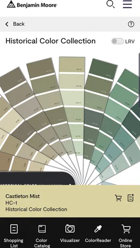
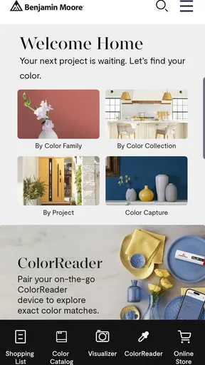
 Analysis by AppCompare
When I’m choosing a paint color for a room, the hard part isn’t finding a shade I like; it’s imagining how that shade will feel beside the floor, furniture, and daylight I already have. Color Portfolio is a free House & Home app from Benjamin Moore Co. that gives me a way to explore paint colors before I commit to a brush or a sample pot. It suits early planning especially well: I can narrow down ideas on my phone, then use those ideas to guide a real-world decision.
What the app is best at today
The app is aimed at people who want to browse Benjamin Moore colors and think through possibilities visually. That makes it useful for a homeowner planning one room, a renter weighing a temporary refresh, or a decorator collecting options to discuss with a client. It is less of a general-purpose design studio than a focused starting point for paint decisions, and I find that focus helpful when I’m staring at too many possibilities.
Its audience is broad: the age rating is Everyone, and the app has passed 500K+ installs. It holds an average rating of 3.6 from around 4.9K ratings, with 365 written reviews. Those figures suggest a tool that many people have tried, while also leaving room for mixed experiences. I would treat it as a convenient planning aid, not as a guarantee that an on-screen shade will match a finished wall.
How I would use it before buying paint
A practical workflow starts with the room rather than the color catalog. I’d take a clear photo in the kind of light the room usually gets, then use the image as a reference while comparing candidate shades. A picture can help me notice whether I’m drawn to warm, cool, muted, or bright colors, but the screen and camera both affect what I see. I’d use the app to reduce a long list to a few contenders, not to make the final purchase decision from a phone display alone.
For example, imagine I’m repainting a small bedroom after work and have only a few minutes to look at options. I can save the room photo, compare a handful of colors, and keep the most convincing directions in one place. Later, I can revisit those choices with the actual bedding and flooring in mind. This makes the app most valuable as a way to organize a decision, not as a substitute for checking a physical sample against the wall.
Product evolution and what it means for regular users
Color Portfolio was released on Jan 15, 2020, and its current version is 2.9.2. That gives existing users a clear point of reference for the software they are opening now, but version numbers alone do not tell me which specific tools changed or how the interface has evolved. I wouldn’t assume a particular feature was added recently just from the version label. What matters in practice is whether the current app still fits the way you compare paint ideas and whether it works comfortably on your device.
If you already use it, the sensible approach is to keep your color decisions grounded in the room itself. A saved shortlist is more useful when it includes context—what room it is for, what light you considered, and which furnishings must stay—than when it is just a stack of attractive swatches. That small habit makes it easier to return later without confusing a color you liked in isolation with one that actually suits the space.
Worth Reading Before You Choose

EA SPORTS FC Mobile 26 Is a Bigger Football Game, but It Takes Time

Flipboard Shows What News Apps Must Do Beyond the Feed

Switching to Android Auto Means Rethinking Your Driving Routine

Google Calendar Makes a Crowded Week Easier to Manage

Ludo King Makes the Most of the Minutes Between Plans

Baby Panda World Brings Quick Play to Modern Phones, but Its Game Library Feels Busy
The Magic of Color Exploration
Right off the bat, Color Portfolio dazzled me with its intuitive interface. The app is all about color experimentation and makes it super easy to dive into the world of hues, shades, and tints. The app’s design is sleek and straightforward, ensuring you don’t get overwhelmed by too many options or confusing menus.
One of the coolest features is the color wheel. I spent a good chunk of time just spinning it around, watching how different colors complement or contrast with each other. It’s like having a digital artist’s palette right at your fingertips. You can select from pre-set palettes or create your own, which is a fantastic way to bring your creative visions to life.
Features That Stand Out
The app offers a nifty color picker tool that lets you extract colors from any photo on your device. Imagine you see a stunning sunset or a beautifully decorated room, and you want those exact colors for your project. Snap a picture, open it in the app, and voilà! You’ve got your custom palette ready to go.
Another feature that caught my eye is the harmony section. It provides various options like complementary, triadic, and analogous schemes, making sure you always have the perfect color combination. If you’re someone who struggles with matching colors, this is a lifesaver.
And let’s not forget the integration with other design tools. You can easily export your color palettes to software like Adobe Illustrator or Photoshop, which is a huge plus for professional designers.
Why You'll Love It
Color Portfolio is not just about finding the right shades; it's about inspiring creativity. The app encourages you to experiment and discover new combinations that you might not have thought of. It's like having a mini art class in your pocket.
Plus, the community aspect is a nice touch. You can share your palettes with other users, exchange ideas, and even get feedback. It’s a vibrant community where color enthusiasts come together to inspire and be inspired.
Putting color ideas to work at home
The most useful trick is to treat a photo as a source of direction, not a color measurement. If a snapshot of a favorite cushion or landscape suggests a palette, I’d pick out the general mood first—perhaps soft and earthy, or crisp and high-contrast—then compare paint options against the room’s fixed elements. A camera may shift a color under indoor lighting, so choosing a wall shade solely because it matches a pixel can lead to a surprise. The app helps me translate inspiration into candidates; a real sample helps me decide.
I’d also compare colors in pairs rather than judging a large set all at once. A warm neutral can look calm beside one option and yellow beside another, so the surrounding colors matter. When I’m looking at the app’s harmony suggestions, I’d use them as prompts: a complementary scheme may be lively, but that doesn’t mean every color deserves equal space on a wall. One dominant shade with a smaller accent is often a more practical starting point for a home than applying a full palette evenly.
For shared decisions, I’d use the app to bring a short, clearly labeled selection into a conversation. Instead of asking someone to react to dozens of swatches, I can show a few distinct directions—one warmer, one cooler, one more subdued—and explain what each might do in the room. That makes feedback more specific and reduces the temptation to keep adding options just because the catalog is large.
Where it fits beside other color tools
Compared with a basic color-wheel app, Color Portfolio is more relevant when the goal is choosing paint for a home, because its focus is the Benjamin Moore range rather than unrestricted color mixing. A broad design app may be better if I need to build a full presentation, work across several brands, or keep colors tied to a larger project system. For quickly sampling a color from a photo, a generic image editor can also be enough. I’d choose this app when paint exploration is the main job, not when I need a complete room-planning suite.
There is a trade-off in that focused approach. A palette that works beautifully as a digital combination may still need to be checked in the actual room, and a user who wants to compare products across paint makers may prefer a more brand-neutral tool. The app’s value is strongest when its color collection is relevant to the paint decision you’re making. If you have already settled on another paint range, its usefulness naturally narrows.
Who should use it—and who may not need it
I’d recommend it to someone at the beginning of a decorating decision: a first-time homeowner, a person refreshing a single room, or a creative who likes turning photographs into color inspiration. It can also help a design professional prepare an initial conversation, provided the app is treated as a quick visual aid rather than a replacement for a careful specification process.
I’d skip it if you already know the exact paint color you want and only need to locate or purchase it, or if your priority is a detailed 3D room mock-up with furniture placement and renovation planning. It is also not the right final authority for anyone who needs a guaranteed screen-to-wall match. In those cases, a physical sample or a more comprehensive room-design tool is a better next step than more time browsing digital palettes.
Small frictions worth planning around
The app is free, which makes experimenting low-pressure, but time can still disappear into browsing. I’d set a limit for the first pass and save only colors that answer a real question: does this work with the wood floor, does it make the room feel calmer, or does it sit well beside a fixed tile? This keeps color exploration from turning into an endless search for a theoretical perfect shade.
There is also a learning curve if color terminology is unfamiliar. The wheel and harmony ideas can be useful, but a scheme name does not tell me whether a color will feel restful in a dim hallway or overpowering in a bright kitchen. I’d start with the room’s purpose and light, then use the app’s suggestions to explore relationships between colors. That order makes the tools easier to interpret and prevents color theory from becoming a distraction.
What I would keep an eye on
For regular users, the meaningful question is not simply whether the version number changes, but whether the app remains practical for comparing colors on the devices they actually use. The current release is 2.9.2, and the minimum OS is 7.1. If you are installing it on an older device, checking compatibility before building a project around it is sensible. I would also keep a separate note of the colors that make the shortlist, so a room decision does not depend on remembering an unfinished browsing session.
My expectations for future changes would stay modest until there is a clear reason to revise them. I’d be glad to see any color tool make it easier to compare a small selection in context, but I wouldn’t plan a decorating project around features I can’t currently rely on. What already matters is whether the app helps you move from vague inspiration to a manageable set of paint possibilities. If it does, it has earned a useful place in the early stages of the job.
The Learning Curve
Now, I’ll be honest, there’s a slight learning curve if you’re not familiar with color theory. But the app does a great job of providing helpful tips and explanations. It’s like it holds your hand through the process, ensuring you’re never left in the dark (pun intended!).
For those who want to delve deeper, there are tutorials and guides that walk you through the more advanced features. It’s a thoughtful addition that makes the app accessible to users of all skill levels.
Final Thoughts
In a nutshell, Color Portfolio is a gem for anyone interested in design or art. It’s user-friendly yet packed with features that cater to both beginners and professionals. The app brings a splash of color to your creative journey and makes the process of selecting and creating palettes a delightful experience.
So, if you’re ready to take your color game to the next level, give Color Portfolio a whirl. Whether you’re painting your next masterpiece or just looking to jazz up a presentation, this app has got you covered. Happy coloring!
Pros
- User-friendly interface for easy navigation.
- Extensive color palette options available.
- Customizable themes for personalization.
- Real-time color adjustment feature.
- Seamless integration with design software.
Cons
- Limited offline functionality.
- Occasional lag on older devices.
- In-app ads can be intrusive.
- Subscription required for premium features.
- Lacks advanced editing tools.
FAQs for Color Portfolio
What is Color Portfolio and how does it work?
Color Portfolio is a comprehensive app designed for artists, designers, and anyone interested in color management. It allows users to create, manage, and organize color palettes efficiently. With an intuitive interface, users can sample colors from images, adjust them with precision, and save them into collections for easy access. It's ideal for professionals and hobbyists alike.
Is Color Portfolio available on both Android and iOS platforms?
Yes, Color Portfolio is available for download on both Android and iOS platforms. The app maintains a consistent user experience across devices, ensuring that users can access their palettes and color collections seamlessly, whether they're using a smartphone or tablet.
Does Color Portfolio require an internet connection to function?
Color Portfolio primarily functions offline, allowing users to create and manage color palettes without an internet connection. However, certain features like cloud backup and sharing palettes with others may require an internet connection. This ensures users have flexibility while working on their projects.
Are there any in-app purchases or subscriptions in Color Portfolio?
While Color Portfolio offers a range of features for free, there are optional in-app purchases available. These may include additional color management tools, cloud storage options, and premium palettes. A subscription model might also be available for users who want to access exclusive features and regular updates.
How user-friendly is Color Portfolio for beginners?
Color Portfolio is designed with user-friendliness in mind, making it accessible for both beginners and experienced users. The app includes tutorials and a simple interface to guide new users through the process of creating and managing color palettes. Its intuitive design ensures a smooth learning curve for all.


